
When I joined ScanSan Properties as Founding Designer, there were no brand guidelines, no colour, no design system. Just a conceptual logo. Everything had to be built from the ground up to bring prime quality digital products to life for PropTech B2B and institutional clients.
What started in 2022 became the shared foundation for the whole product line: PAA, PVA, Tokenization and Guardian.
CLIENT
CLIENT
Scansan Properties
Scansan Properties
INDUSTRY
INDUSTRY
PropTech, AI
PropTech, AI
ROLE
ROLE
Founding Designer
Founding Designer
TOOLS
TOOLS
TOOLS
Figma
Figma
YEAR
YEAR
YEAR
2024
2024
THE FOUNDATION
THE FOUNDATION
FIVE SCALES
FIVE SCALES
FIVE SCALES
EVERY SWATCH SCORED
EVERY SWATCH SCORED
EVERY SWATCH SCORED
Gray, brand, error, warning and success, each on its own scale, with a WCAG contrast score on every swatch.
Gray, brand, error, warning and success, each on its own scale, with a WCAG contrast score on every swatch.
Gray is the foundation. Text, fields, backgrounds and dividers all come from it, which keeps the dark interface calm enough for dense data to sit on top. Brand blue is reserved for anything you can click, so a user learns once, across any ScanSan product, that blue means action.
Error, warning and success cover destructive actions, on hold states and confirmations. Every swatch shows its contrast ratio, and the shades that fail carry no AA label. Nobody has to guess which colours can hold text and which can only fill a bar.
Gray is the foundation. Text, fields, backgrounds and dividers all come from it, which keeps the dark interface calm enough for dense data to sit on top. Brand blue is reserved for anything you can click, so a user learns once, across any ScanSan product, that blue means action.
Error, warning and success cover destructive actions, on hold states and confirmations. Every swatch shows its contrast ratio, and the shades that fail carry no AA label. Nobody has to guess which colours can hold text and which can only fill a bar.

THE TYPOGRAPHY
THE TYPOGRAPHY
One typeface. One scale for web and product.
One typeface. One scale for web and product.
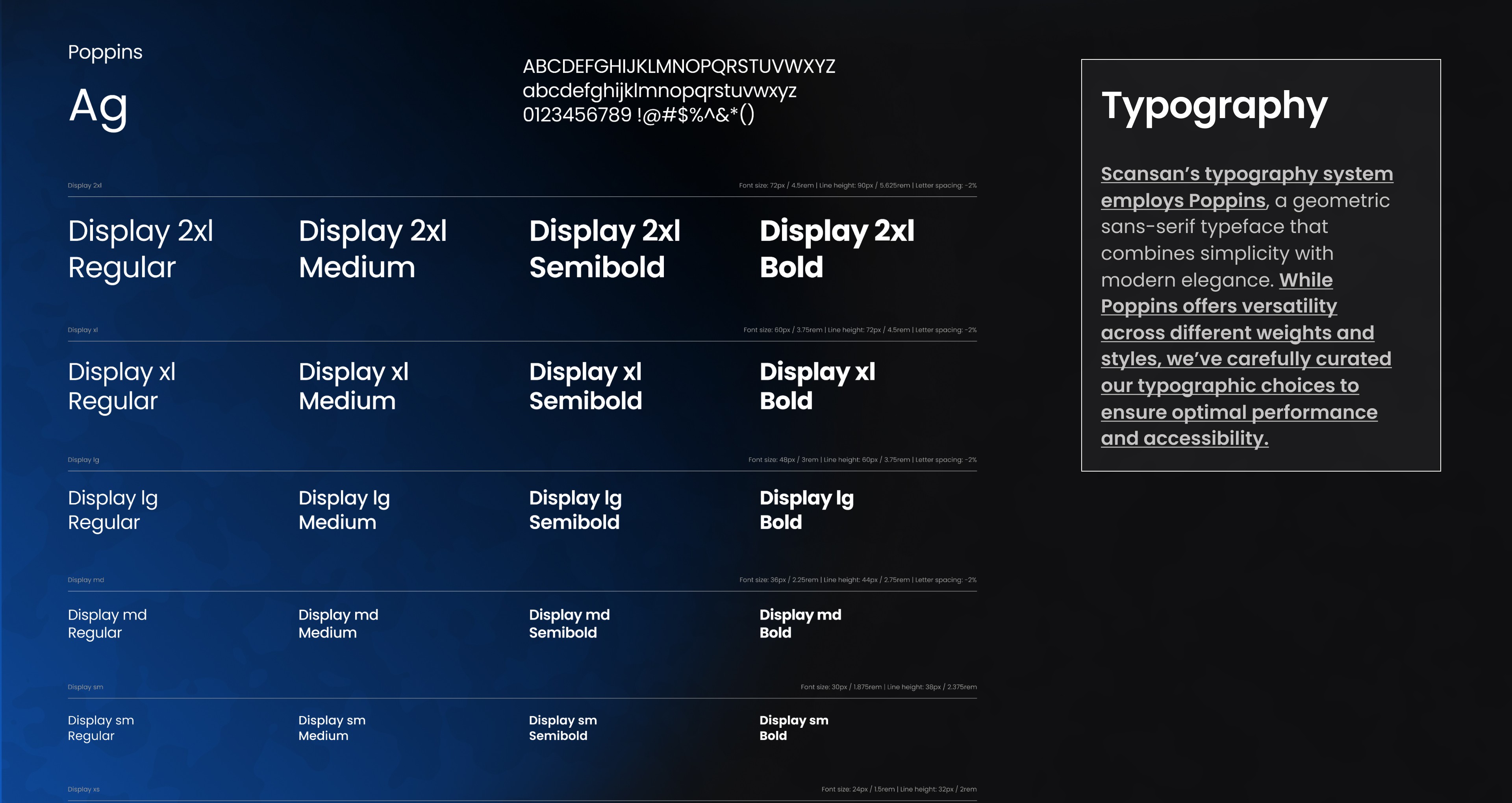
Poppins carries everything. It's geometric and clean, and it reads as well in a large marketing headline as in a small figure on a chart axis, which matters when most of the screen is numbers. I kept it to regular, medium, semibold and bold, with display sizes running from 72px down to 12px.
Each size has its own fixed line height, and the larger ones use tighter tracking so headlines hold together. The range was built to cover the full surface in one pass: website and landing pages at the top end, desktop product screens through the middle, mobile labels and chart axes at the bottom. One scale, so there was never a second system to maintain.
Poppins carries everything. It's geometric and clean, and it reads as well in a large marketing headline as in a small figure on a chart axis, which matters when most of the screen is numbers. I kept it to regular, medium, semibold and bold, with display sizes running from 72px down to 12px.
Each size has its own fixed line height, and the larger ones use tighter tracking so headlines hold together. The range was built to cover the full surface in one pass: website and landing pages at the top end, desktop product screens through the middle, mobile labels and chart axes at the bottom. One scale, so there was never a second system to maintain.
SPACING & ICONOGRAPHY
SPACING & ICONOGRAPHY
Everything sits on a 4px grid. The icons follow the same rhythm.
Everything sits on a 4px grid. The icons follow the same rhythm.
Spacing runs on a 4px grid across seventeen steps, from 4px up to 256px, documented in both rem and pixels on a 16px root so the numbers mean the same thing to a designer and a developer. The padding inside a chart card and the gap between two cards come from the same list. On screens this dense, that steady rhythm is what lets the eye group related data without extra lines or boxes.
The icon set follows that rhythm. It covers the vocabulary the products need, such as buildings, banks, maps, analytics and comparisons, and every icon comes in thin, regular, medium and bold. That lets it match the weight of the label beside it while keeping the same outline style throughout.
Spacing runs on a 4px grid across seventeen steps, from 4px up to 256px, documented in both rem and pixels on a 16px root so the numbers mean the same thing to a designer and a developer. The padding inside a chart card and the gap between two cards come from the same list. On screens this dense, that steady rhythm is what lets the eye group related data without extra lines or boxes.
The icon set follows that rhythm. It covers the vocabulary the products need, such as buildings, banks, maps, analytics and comparisons, and every icon comes in thin, regular, medium and bold. That lets it match the weight of the label beside it while keeping the same outline style throughout.


THE COMPONENTS
THE COMPONENTS
EVERY STATE
EVERY STATE
EVERY STATE
WRITTEN DOWN
WRITTEN DOWN
WRITTEN DOWN
Buttons, navigation and plan cards, each documented from default through hover and focus to disabled or clicked.
Buttons, navigation and plan cards, each documented from default through hover and focus to disabled or clicked.
Action buttons for share, download report, compare, feedback and bookmarks come in outline and filled versions. Sidebar items carry an optional Pro badge and four documented states. Primary and destructive buttons each get their own set, so a red button behaves exactly like a blue one, just with different consequences.
Larger pieces live in the same library, like the upgrade prompt in the sidebar and the plan comparison with its yearly and monthly toggle. I wrote the naming conventions and token documentation so other designers could extend all of it without me.
Action buttons for share, download report, compare, feedback and bookmarks come in outline and filled versions. Sidebar items carry an optional Pro badge and four documented states. Primary and destructive buttons each get their own set, so a red button behaves exactly like a blue one, just with different consequences.
Larger pieces live in the same library, like the upgrade prompt in the sidebar and the plan comparison with its yearly and monthly toggle. I wrote the naming conventions and token documentation so other designers could extend all of it without me.

CHARTS
CHARTS
PAA is read in charts. Everything else leads you to them.
PAA is read in charts. Everything else leads you to them.
The system had to serve four products, and PAA, the flagship, asked the most of it. It exists to analyse areas across the UK, so charts were never a decoration on top of the foundations. Every question an agent asked had a different shape, whether a distribution, a trend, a ranking or a comparison, and each one needed building ad hoc on the same tokens. I designed more than fifty chart variants to cover every scenario we found, and only a few are shown here.
They all follow one grammar. In a comparison, the first area is always blue and the second is always yellow. Safety levels reuse the success, warning and error scales, and year over year changes carry a green or red arrow. Where a chart might hide detail, a Table toggle sits beside it.
The system had to serve four products, and PAA, the flagship, asked the most of it. It exists to analyse areas across the UK, so charts were never a decoration on top of the foundations. Every question an agent asked had a different shape, whether a distribution, a trend, a ranking or a comparison, and each one needed building ad hoc on the same tokens. I designed more than fifty chart variants to cover every scenario we found, and only a few are shown here.
They all follow one grammar. In a comparison, the first area is always blue and the second is always yellow. Safety levels reuse the success, warning and error scales, and year over year changes carry a green or red arrow. Where a chart might hide detail, a Table toggle sits beside it.


THE OUTCOME
THE OUTCOME
One system. Four products.
One system. Four products.
ScanSan went from a conceptual logo to a documented visual language that four products share, and a library the team could keep building on after me. Users learn the colour, spacing and state logic once and reuse it everywhere, from a tokenization page to a PAA chart card.
ScanSan went from a conceptual logo to a documented visual language that four products share, and a library the team could keep building on after me. Users learn the colour, spacing and state logic once and reuse it everywhere, from a tokenization page to a PAA chart card.
50+
50+
Chart variants designed for PAA
Chart variants designed for PAA
140+
140+
Components designed between 2022 and 2024, system still evolving
Components designed between 2022 and 2024, system still evolving
Let's chat on WhatsApp

Marko
Hi, How can I help you? :)

MENU
Home
Home
Home
Home
CONTACT
markoferrari@proton.me
GET IN TOUCH
MENU
Home
Home
Home
Home
CONTACT
markoferrari@proton.me
GET IN TOUCH