
Orotig builds industrial equipment for goldsmiths and precious-metal workshops. EcoTech can run two melting processes at once, but its interface had grown around the machine rather than the person operating it. I redesigned the experience from the ground up, from research and workflow architecture to the UI system and development handoff.
CLIENT
CLIENT
Orotig S.p.A.
Orotig S.p.A.
INDUSTRY
INDUSTRY
Industrial B2B, melting and laser equipment for goldsmiths
Industrial B2B, melting and laser equipment for goldsmiths
ROLE
ROLE
Solo UX and UI designer
Solo UX and UI designer
TOOLS
TOOLS
TOOLS
Figma, Field Interviews, Rapid Prototyping, Affinity Design, Notion
Figma, Field Interviews, Rapid Prototyping, Affinity Design, Notion
YEAR
YEAR
YEAR
2023
2023
THE PROBLEM
THE PROBLEM
TWO CHAMBERS
TWO CHAMBERS
TWO CHAMBERS
ONE SCREEN
ONE SCREEN
ONE SCREEN
The furnace doubled its capability and inherited a control panel drawn in the nineties for a different machine.
The furnace doubled its capability and inherited a control panel drawn in the nineties for a different machine.
The previous interface could control the furnace, but it made operators work harder than necessary. Important information was spread across screens, programs were difficult to manage, and the visual hierarchy had grown around the machine's technical capabilities rather than the operator's attention.
The people using it already understood the machine. They didn't need more technical information. They needed to see what mattered, make a decision quickly, and get back to the work. That became the starting point for the redesign.
The previous interface could control the furnace, but it made operators work harder than necessary. Important information was spread across screens, programs were difficult to manage, and the visual hierarchy had grown around the machine's technical capabilities rather than the operator's attention.
The people using it already understood the machine. They didn't need more technical information. They needed to see what mattered, make a decision quickly, and get back to the work. That became the starting point for the redesign.
BUSINESS AND CLIENT'S NEEDS
BUSINESS AND CLIENT'S NEEDS
Nobody looked at the panel for three seconds. They looked at the metal.
Nobody looked at the panel for three seconds. They looked at the metal.
I spent the research phase understanding how operators actually interacted with the furnace, rather than how the interface expected them to. The important moments happened around the machine, not inside the software.
Operators glanced at the screen between physical tasks. They needed to confirm a state, check a value or change a program without losing sight of the process. The interface therefore had to communicate hierarchy at a glance, not ask people to stop and read.
I spent the research phase understanding how operators actually interacted with the furnace, rather than how the interface expected them to. The important moments happened around the machine, not inside the software.
Operators glanced at the screen between physical tasks. They needed to confirm a state, check a value or change a program without losing sight of the process. The interface therefore had to communicate hierarchy at a glance, not ask people to stop and read.


THE DECISION
THE DECISION
Twenty named presets. Not two numbered slots.
Twenty named presets. Not two numbered slots.
The previous system stored two programs. That limit wasn't just a storage problem. It forced operators to remember what each numbered slot represented and rebuild settings that could have been saved.
I chose to turn programs into a proper library. Operators could store up to twenty named presets and organise them around the materials and processes they actually work with. The decision was simple: make the software remember the work, instead of asking the operator to remember the software.
The previous system stored two programs. That limit wasn't just a storage problem. It forced operators to remember what each numbered slot represented and rebuild settings that could have been saved.
I chose to turn programs into a proper library. Operators could store up to twenty named presets and organise them around the materials and processes they actually work with. The decision was simple: make the software remember the work, instead of asking the operator to remember the software.

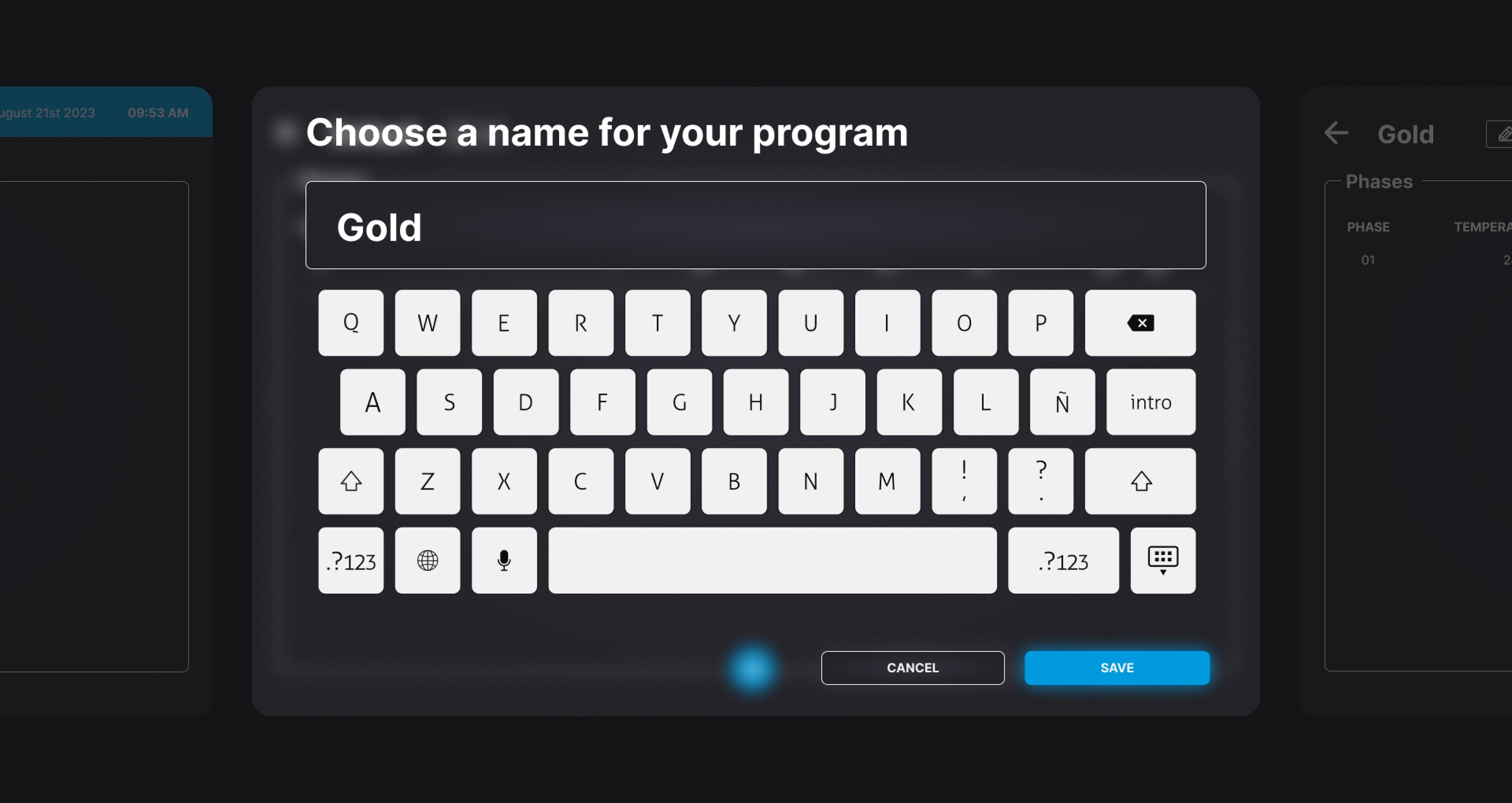
Adding more slots would have been the easy fix. Naming and organising them around real workshop behaviour made them useful.


Once the Material has been created and set, the user can pick it and associated with the Chamber he wants to use to melt that material.
Once the Material has been created and set, the user can pick it and associated with the Chamber he wants to use to melt that material.
THE SOLUTION
THE SOLUTION
ONE SYSTEM
ONE SYSTEM
ONE SYSTEM
BOTH CHAMBERS
BOTH CHAMBERS
BOTH CHAMBERS
Two chambers, two programs, one screen, with colour carrying every state across both.
Two chambers, two programs, one screen, with colour carrying every state across both.
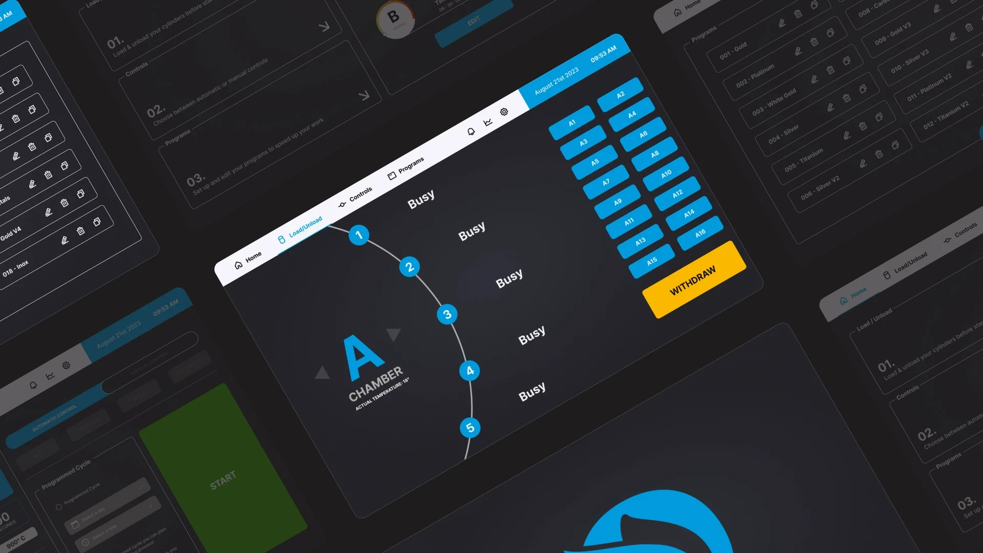
The new interface brings the two melting chambers into a single workspace. Each chamber has its own clear visual identity, while the overall hierarchy stays consistent so operators can understand what is happening without scanning between unrelated screens.
I also redesigned program management, machine status, controls and feedback as one connected system. Colour is used to communicate state rather than decoration, while the information hierarchy puts the values and actions needed during a cycle where they can be found immediately.
The result is an interface that gives the machine more room to communicate without making the operator work harder to understand it.
The new interface brings the two melting chambers into a single workspace. Each chamber has its own clear visual identity, while the overall hierarchy stays consistent so operators can understand what is happening without scanning between unrelated screens.
I also redesigned program management, machine status, controls and feedback as one connected system. Colour is used to communicate state rather than decoration, while the information hierarchy puts the values and actions needed during a cycle where they can be found immediately.
The result is an interface that gives the machine more room to communicate without making the operator work harder to understand it.

Industrial software often tries to prove how much the machine can do. I wanted EcoTech to show what the operator needs to know.
THE BUILD
THE BUILD
Handed over as a system, not a set of screens.
Handed over as a system, not a set of screens.
The final design included full interaction specifications, a component library and edge-case documentation for Orotig's development team. The system was designed to remain consistent beyond the screens shown in the case study, covering states, controls and the interactions operators would encounter during real use.
The final design included full interaction specifications, a component library and edge-case documentation for Orotig's development team. The system was designed to remain consistent beyond the screens shown in the case study, covering states, controls and the interactions operators would encounter during real use.
THE OUTCOME
THE OUTCOME
Setup down to two and a half minutes. Wrong chamber errors at zero.
Setup down to two and a half minutes. Wrong chamber errors at zero.
The redesign reduced average setup time from around seven minutes to approximately two and a half. Onboarding also became around 60% faster, while the program system expanded from two stored programs to twenty.
During beta testing, the redesigned interface also eliminated wrong-chamber errors across the three test sites. The numbers matter, but the bigger change was simpler: operators could understand the machine's state faster and spend less time working out where the interface had put something.
The redesign reduced average setup time from around seven minutes to approximately two and a half. Onboarding also became around 60% faster, while the program system expanded from two stored programs to twenty.
During beta testing, the redesigned interface also eliminated wrong-chamber errors across the three test sites. The numbers matter, but the bigger change was simpler: operators could understand the machine's state faster and spend less time working out where the interface had put something.
7 min → 2.5 min
7 min → 2.5 min
Cycle setup time per melt
Cycle setup time per melt
60%
60%
Faster onboarding, two days down to four hours
Faster onboarding, two days down to four hours
0
0
Wrong chamber errors, three beta sites over six weeks
Wrong chamber errors, three beta sites over six weeks
2 → 20
2 → 20
Storable programs, each one renameable
Storable programs, each one renameable
Six weeks across three sites is a short window for an error count. Zero wrong chamber assignments is what those sites recorded, not a claim that the interface makes the mistake impossible.
Six weeks across three sites is a short window for an error count. Zero wrong chamber assignments is what those sites recorded, not a claim that the interface makes the mistake impossible.
Let's chat on WhatsApp

Marko
Hi, How can I help you? :)
MENU
Home
Home
Home
Home
CONTACT
markoferrari@proton.me
GET IN TOUCH
MENU
Home
Home
Home
Home
CONTACT
markoferrari@proton.me
GET IN TOUCH