
CONTEXT AND BRIEF
Redesigning a PropTech platform where trust is the product and clarity is the only conversion tool that matters.
Scansan Properties sits at the intersection of PropTech, Web3, and AI, offering fractional property ownership and an AI assistant for estate agents.
The existing website looked like a standard real estate directory at exactly the moment the product was evolving into something structurally different. The design was not keeping pace with the ambition.
Scansan's product proposition is genuinely unusual: a platform where UK residential properties can be tokenised as digital assets, allowing fractional ownership via blockchain, alongside a Property Assistant tool that uses AI to handle market research, client queries, and property reporting for over 200 estate agents. Neither of those things fits the visual grammar of a traditional property website. The original site communicated none of it.
Client
Scansan Properties
Industry
Industrial – B2B · AI - Web 3
Year
2026
Role
Solo UX/UI Designer
Duration
4 months


PROBLEM DEFINITION
The old site presented a technically sophisticated product using the visual language of a 2015 estate agency. First impressions were actively undermining conversion and credibility.
Someone landing on the homepage had no way of knowing they were looking at a company rewriting how property investment works. That gap between reality and perception was the starting point.

PROCESS AND EXPLORATION
The project started with multiple user interviews (9) across both audiences.
Estate agents were consistent about one thing: they evaluate tools by how quickly they can picture using them in front of a client. Abstract product copy does not land. Investors were consistent about something different: they wanted to understand the mechanics before they trusted the brand. Those are competing information hierarchies, and the navigation architecture had to respect that tension rather than flatten it.
The design process worked outward from the homepage hero, which carried the hardest job: acknowledge both users, signal innovation, and hold enough visual authority to feel safe. From there, the PAA product section and the tokenisation platform section were built as separate narrative lanes, each with their own entry points, proof points, and CTAs. The design system was built in parallel so every component could scale across both product verticals without visual inconsistency.


Rather than try to merge both user types into a single narrative, the homepage was structured as a soft fork: one visual anchor, two distinct paths forward.
Built on Wix Studio. Two entirely different user types and product verticals had to be served from a single homepage without friction or confusion.
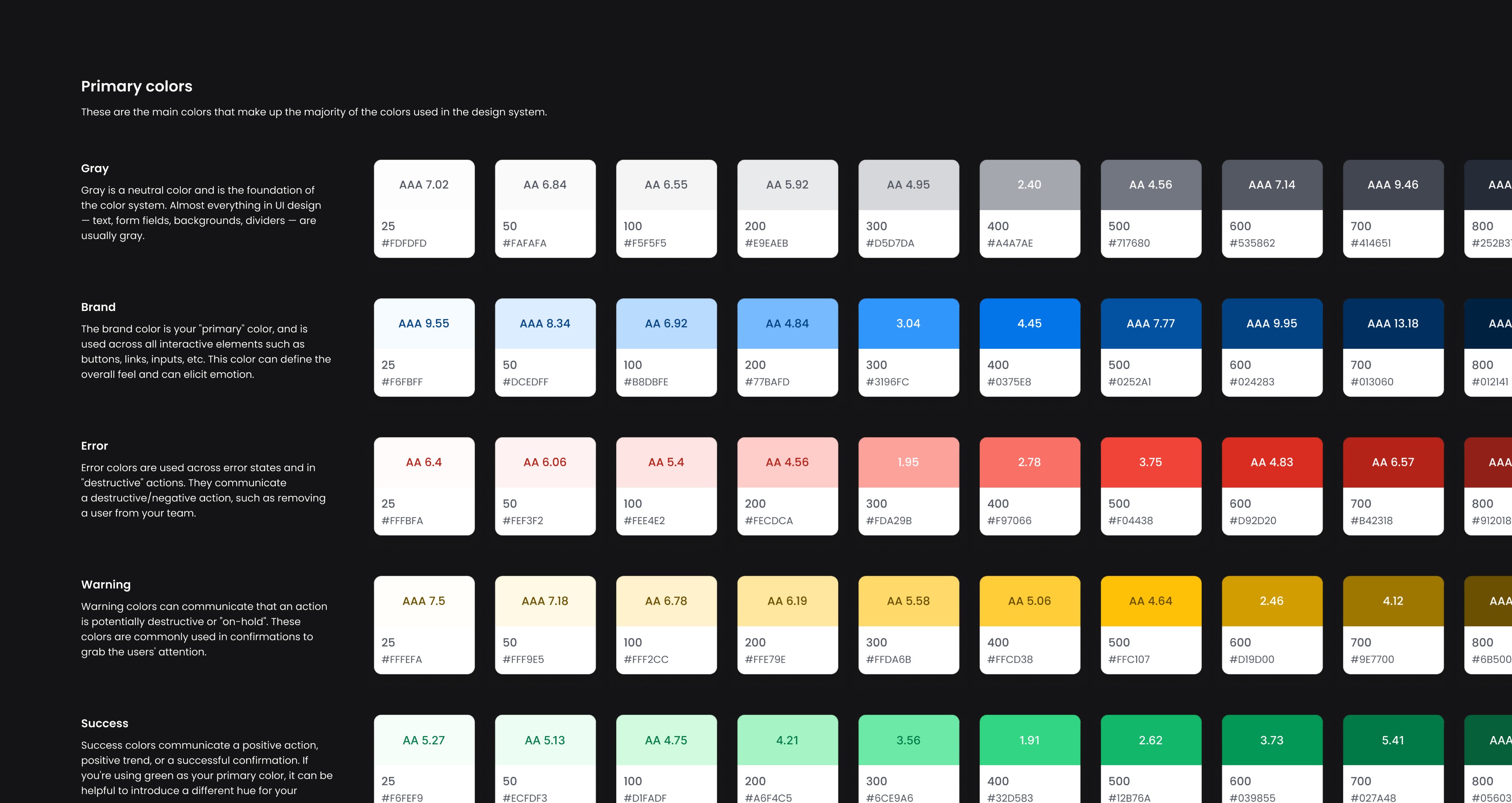


The redesign opened with a hero that named the ambiguity directly. Instead of generic property photography and vague taglines, the headline positioned Scansan as infrastructure for modern property investment, specific enough to filter in the right visitors and confident enough to signal that this is not a standard listing site. Below the fold, the two product verticals were given separate sections with their own visual language: the PAA section was built around workflow integration and time savings, the tokenisation section around security, transparency, and fractional accessibility. The design system used a restrained palette that borrowed from fintech rather than real estate, signalling precision and trust over warmth and lifestyle. Mobile-first flows were redesigned end to end, with particular attention to the agent dashboard entry points where drop-off had been highest.
Monthly engagement
+35%
Active agent users
200+
PAA new subscribers YTD
+21%

