
CONTEXT AND BRIEF
A precision robotics company preparing for international expansion with a prefabricated logo pulled from the internet and no real brand to speak of.
Megic is a precision robotics company specialising in industrial automation and laser welding technology. Founded in 2018, they had built a strong engineering reputation and a growing client base in manufacturing, with every system tailored to the specific requirements of each customer. Six years in, the technology was cutting-edge. The brand was a stock logo downloaded from the internet and attached to everything. There was no visual identity to speak of, just a placeholder that had never been replaced.
Megic's leadership was preparing to expand into new European markets and had a major trade show on the horizon: Automatica 2024 in Munich, one of the largest robotics exhibitions in Europe. They were going to be competing for attention against Universal Robots, KUKA, ABB, and Fanuc with a generic cog-and-wordmark combination that anyone could have bought for twelve euros on a stock icon site. The CEO described it directly: "Our robots are cutting-edge, but our brand looks like it's from the 1990s." The brief was not a rebrand. There was nothing to rebrand. The brief was to build a brand from scratch, before Munich.
Client
Megic
Industry
Industrial Robotics – B2B
Year
2024
Role
Brand Identity Designer
Duration
3 months

PROBLEM DEFINITION
Five existing clients were asked to recall the Megic logo. No one could describe it accurately. A bad brand gets remembered for the wrong reasons. This one wasn't being remembered at all.
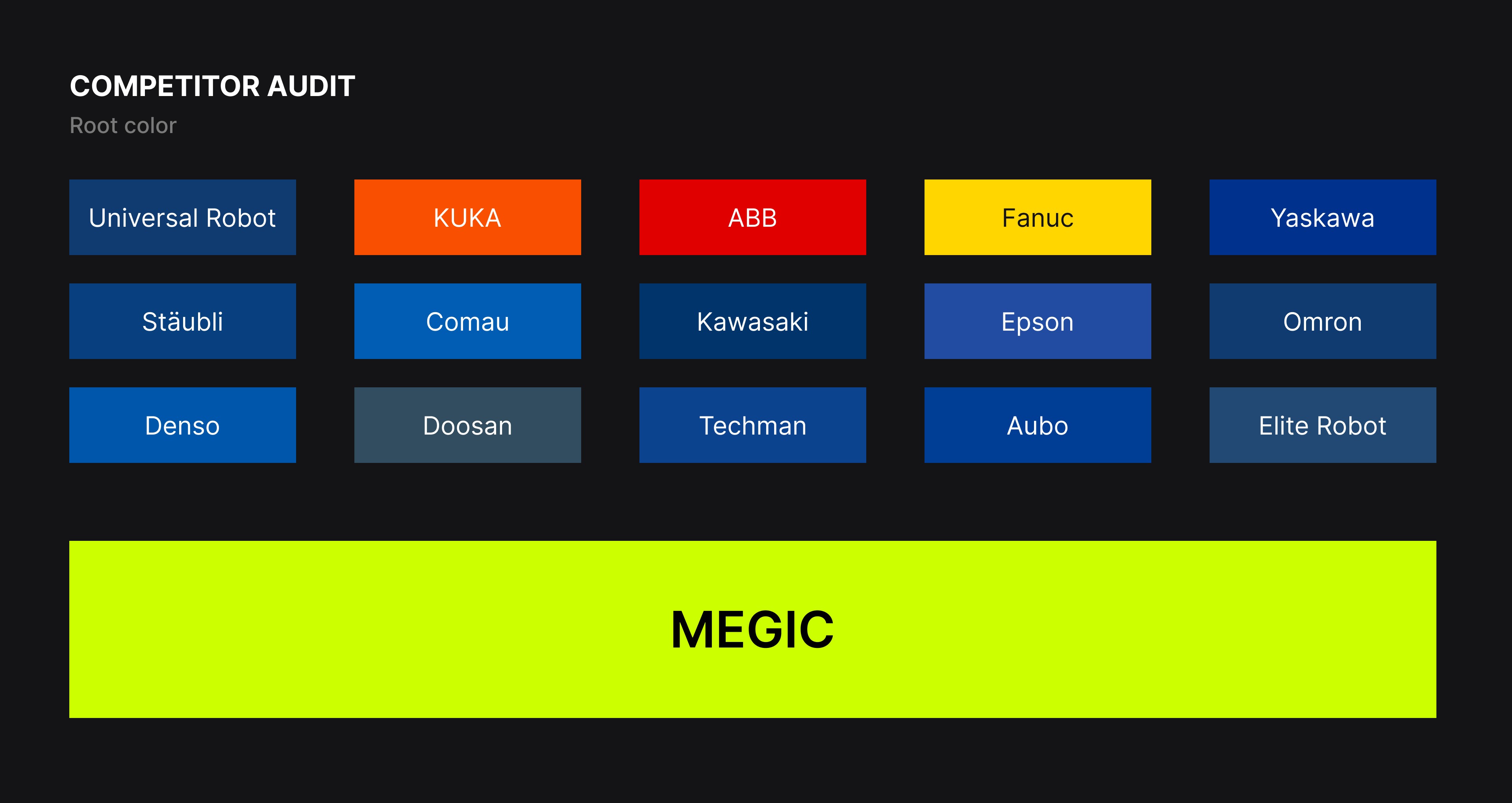
The competitive audit of 15 brands in the industrial robotics sector produced a single overwhelming finding: the entire market was communicating through the same visual language. Blue palettes. Circular iconography. Conservative sans-serif typography. Every brand was signalling reliability and seriousness in identical ways, which meant none of them were actually memorable. Stakeholder workshops with Megic's leadership and senior engineers revealed a second gap, internal this time. The engineering team took genuine pride in their customisation capabilities — no Megic system is off-the-shelf, every one is built around the client's specific requirements. The sales team felt the existing materials looked cheap relative to competitors with larger budgets. Three customers described Megic as "reliable but forgettable." The technology and the brand were telling different stories about the same company.

PROCESS AND EXPLORATION
The competitive audit had made one thing clear: breaking from blue was not a stylistic preference, it was a strategic necessity. If every competitor in the sector was using the same palette, any brand within that palette was invisible by definition. Electric Lime arrived not as an aesthetic choice but as a logical conclusion.
High visibility in trade show environments. Unexpected in the industrial sector, which is exactly what makes it memorable. Already present in industrial contexts as a high-visibility safety colour, which means it carries subconscious credibility rather than feeling foreign.
The logo mark went through two distinct directions before finding its resolution. The first explored a robotic arm silhouette, a literal visualisation of the product. The feedback was immediate: too predictable, dated despite a modern execution. The second explored a geometric abstract M, constructed from parallel lines suggesting precision and modularity. That direction had the right qualities but needed to earn its connection to the company more directly. The final mark resolved both. Precisely calibrated lines that create negative space, readable simultaneously as movement, as the vertex of an M, and as the kind of trajectory a robotic arm traces through space.
A mark that communicates what Megic does without illustrating it.
The product naming architecture was the unexpected pivot in the project. Megic's existing alphanumeric system, MG-400, MG-600R, MG-1200X, was technically accurate and completely unmemorable. Customer interviews confirmed it.
Working with the leadership team, three named series replaced the codes: Ether for the ultra-lightweight collaborative systems, Caspian for the mid-payload workhorses, Axiom for the heavy-duty platforms. The numbers stayed, now indicating payload in kilograms. The names created hierarchy, narrative, and something worth remembering.


Chose Electric Lime as the primary brand colour not despite the industrial context but because of it. The entire sector was blue. The only way to be seen was to stop being blue.
The competitive audit of 15 brands in the industrial robotics sector produced a single overwhelming finding: the entire market was communicating through the same visual language. Blue palettes. Circular iconography. Conservative sans-serif typography. Every brand was signalling reliability and seriousness in identical ways, which meant none of them were actually memorable. Stakeholder workshops with Megic's leadership and senior engineers revealed a second gap, internal this time. The engineering team took genuine pride in their customisation capabilities — no Megic system is off-the-shelf, every one is built around the client's specific requirements. The sales team felt the existing materials looked cheap relative to competitors with larger budgets. Three customers described Megic as "reliable but forgettable." The technology and the brand were telling different stories about the same company.


A complete brand identity built on a single strategic bet: that breaking every visual convention of the industrial robotics sector was the only way to be remembered within it. Electric Lime and Deep Space Black as the palette. A geometric mark readable as movement, structure, and the letter M simultaneously. Uniwars as the typeface for its precision without pretension. A multi-tier product naming architecture replacing alphanumeric codes with names that hold meaning. Applied across a 42-page brand book, trade show graphics, product badges, digital collateral, and workwear.
Booth traffic at Automatica 2024 vs Automatica 2023 (Booth Badge scanning)
+47%
Qualified leads captured at the show (year on year - Lead only, not deals finalized)
68 → 114
Attendees who mentioned the booth design unprompted during conversations
12+

