
CONTEXT AND BRIEF
Every Latin American restaurant in Glasgow was casual, colourful, and affordable. El Santo needed to be none of those things.
El Santo is a Latino-American bar and restaurant in Glasgow's West End, opened in late 2021 by two experienced restaurateurs who had spent years running casual dining establishments. They knew the market well enough to see a gap nobody had filled: Latin American cuisine at the upscale end. Date nights, celebrations, business dinners. Not a quick weeknight meal. The name was chosen before anything else existed. El Santo, The Saint. Everything that followed had to be worthy of it.
Glasgow's Latin American dining scene was homogeneous. Six of eight restaurants in the city were positioned as casual and affordable, with entrées at £10 to £15. Bright colours, playful typography, papel picado, sombreros. The visual language of the entire category was locked into "fun and cheap." El Santo was targeting £25 to £40 per person and needed a brand that could justify that before a single dish arrived. The owners had a name, a vision for sophisticated Latin American dining, and an opening date six months away. Nothing else existed yet.
Client
El Santo
Industry
Hospitality – B2C · Restaurant
Year
2021
Role
Brand Identity Designer
Duration
6 months


PROBLEM DEFINITION
The upscale position in Glasgow's Latin American dining market was completely unoccupied. Standing out from competitors was going to be the easy part. Getting a city to see Latin American food as fine dining, not as a theme, was the real job.
The competitive audit covered eight Latin American restaurants and ten upscale non-Latin restaurants in Glasgow. Every Latin American venue used bright primaries, literal cultural symbols, and playful typography. Every upscale venue used dark palettes, minimal type, and photography that communicated craft and quality.
The two visual languages belonged to entirely different price brackets and dining occasions. No Latin American restaurant in the city had crossed from one side of that line to the other. Owner workshops confirmed the strategic brief.
The founders were not interested in competing with Chiquito or Topolabamba. Their target customer was 30 to 50 years old, had disposable income, and chose restaurants for celebrations and date nights rather than convenience. The phrase that kept coming up in sessions: "we want people to feel like they're somewhere special, not somewhere themed." That sentence became the creative brief.

PROCESS AND EXPLORATION
The name El Santo unlocked the creative direction. The Saint carries religious weight, a sense of reverence, something treated with care rather than casualness. It suggested the identity should feel like it was handling something precious.
The challenge was finding the visual form for that without becoming literally religious. Three directions were explored.
The first took the name at face value: an illustrated saint figure with a halo combined with typography. It had atmosphere but the owners were right to be cautious. Too devotional, potentially alienating.
The second went the opposite way, pure typography with refined custom lettering and no symbolic element. Clean, but without a distinguishing mark it could have been any Spanish restaurant in any city.
The third found the balance: custom hand-drawn letterforms paired with a crown element and geometric patterns drawn from Aztec sun stone references.
Reverence without religion. Cultural depth without the clichés. The letterforms were drawn by hand rather than adapted from an existing typeface. The slight organic imperfection of hand-drawn letters adds warmth in a way that digital precision cannot replicate.
They connect in places, creating a wordmark that reads as a signature or a seal, something unique to this place. The colour decision followed the same logic as the structural one. Every casual Latin American restaurant was using bright primaries. Deep burgundy, warm black, and antique gold placed El Santo immediately alongside Glasgow's upscale wine bars and fine dining rooms rather than its Mexican chains.
The palette change alone communicated a £20 price difference before anyone read the menu.


Drew the letterforms by hand rather than adapting an existing typeface. A restaurant at this price point needs to feel like it was made for this place specifically. A font, however refined, cannot do that.
The competitive audit covered eight Latin American restaurants and ten upscale non-Latin restaurants in Glasgow. Every Latin American venue used bright primaries, literal cultural symbols, and playful typography. Every upscale venue used dark palettes, minimal type, and photography that communicated craft and quality.
The two visual languages belonged to entirely different price brackets and dining occasions. No Latin American restaurant in the city had crossed from one side of that line to the other. Owner workshops confirmed the strategic brief.
The founders were not interested in competing with Chiquito or Topolabamba. Their target customer was 30 to 50 years old, had disposable income, and chose restaurants for celebrations and date nights rather than convenience. The phrase that kept coming up in sessions: "we want people to feel like they're somewhere special, not somewhere themed." That sentence became the creative brief.
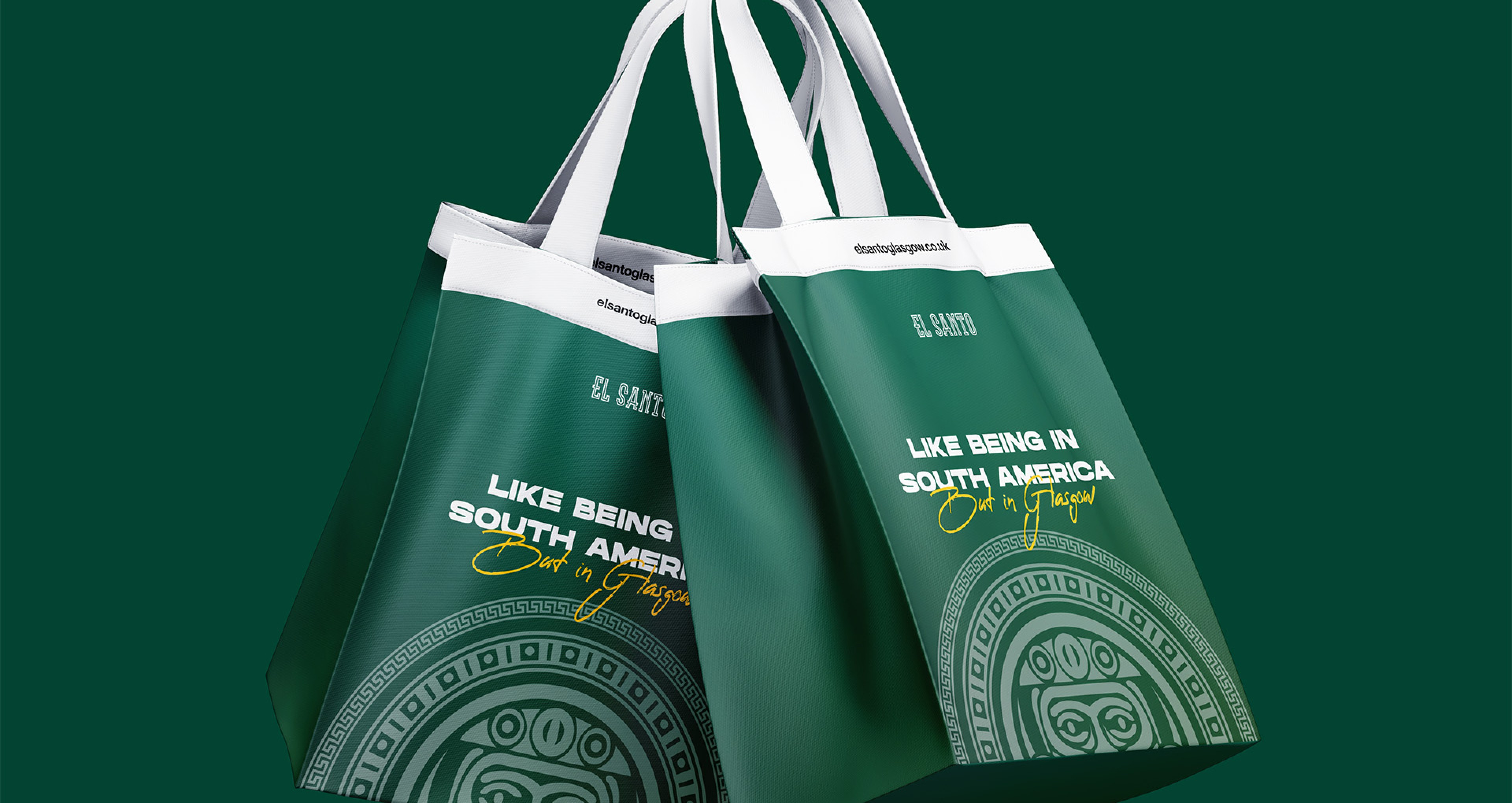


A complete brand identity and launch campaign for Glasgow's first upscale Latin American restaurant. Hand-drawn logotype with a crown element and Aztec sun stone geometric pattern. Deep burgundy, warm black, and antique gold as the palette, chosen specifically to remove El Santo visually from the casual Mexican category and place it alongside the city's fine dining establishments. Applied across leather-bound menus, entrance signage, business cards with gold foil, coasters, cocktail napkins, and a 6-week outdoor campaign across 25 locations and 3 billboards that generated 340 reservations before the doors opened.
Reservations booked before opening day. Fully booked for the first 2 weeks.
340
Instagram followers before the restaurant opened, from zero, in 6 weeks
1,700
Average spend per person in the first 3 months, against £15 to £20 for casual competitors
£34
